Alienware Area-51 m9750: Power Gaming on the Go
by Jarred Walton on August 24, 2007 8:00 AM EST- Posted in
- Laptops
LCD Color Accuracy
While the manufacturing date for the LCD panel is the same as what we found for the PC Club ENP660 and HP dv6500t, it should already be clear that the overall display quality is still different. While those two laptops exhibited poor contrast ratios and poor viewing angles, the m9750 definitely fared better. However, we still need to look at color accuracy.
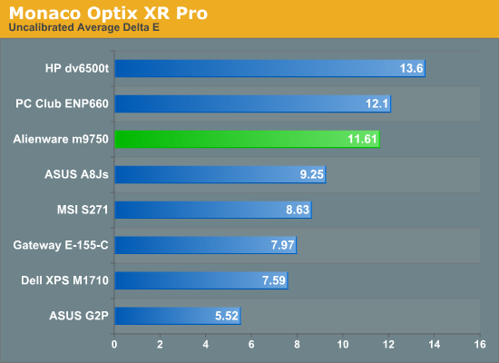
The Alienware m9750 is one of the worst performers when it comes to uncalibrated color accuracy. A Delta E of 11.6 only manages to best the two worst displays that we've looked at. Perhaps not coincidentally, all three of these low-scoring displays reported a manufacturing date of January 2005, though the Alienware has a different panel manufacturer. As bad as the Delta E results look, it is important to remember that our eyes are wonderfully adaptable when it comes to viewing colors, and in actual use the Alienware didn't seem all that bad. Trained professionals will certainly be able to spot the inaccuracies, and any multimedia enthusiasts viewing high-definition content will be disappointed, but unless you're really demanding in terms of color accuracy the contrast ratios and viewing angles probably take precedence.
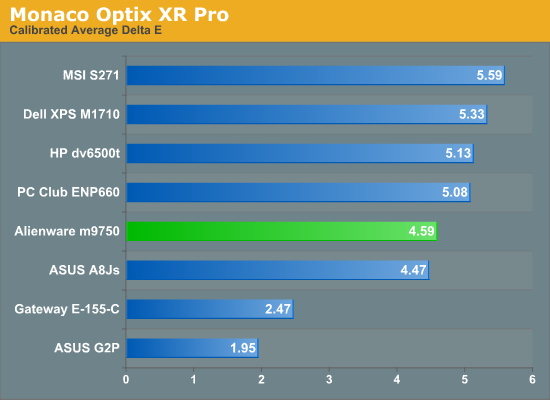
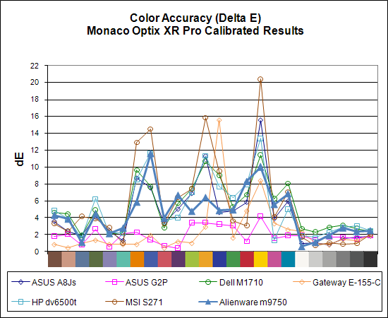
Calibration also helps out, naturally - although not with games or movies as they bypass the color correction profile. After using Monaco Optix XR Pro to calibrate the display, the Area-51 m9750 performs much better. Only the ASUS G2P and Gateway E-155-C are clearly better.
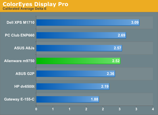
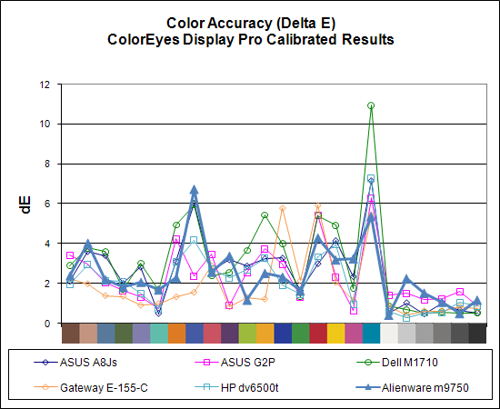
As we have pointed out previously, ColorEyes Display Pro often manages to provide better color accuracy on laptops. CED Pro is also being actively updated, and it runs better under Windows Vista, but that's beside the point. Using CED Pro, the average Delta E drops to 2.5, essentially falling in the middle of our table. Looking at its closest competitor, the Dell XPS M1710, the m9750 bests it in virtually every color accuracy test. While the differences are generally slight, our subjective evaluation supports the conclusion that Alienware uses a better LCD panel than Dell.
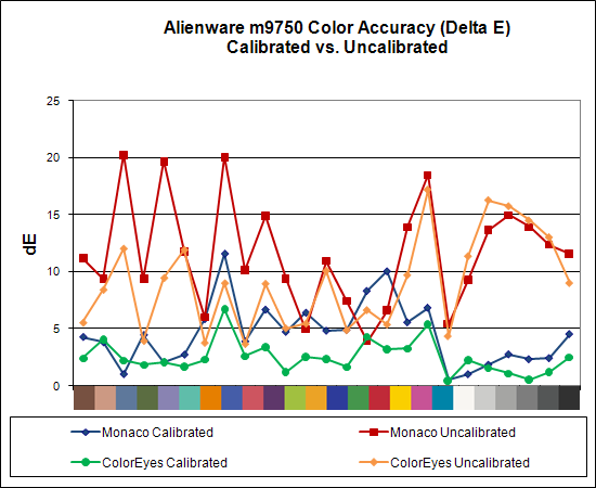
As a final look at the m9750 LCD panel, here's a chart showing calibrated versus uncalibrated Delta E with both Monaco Optix XR Pro and ColorEyes Display Pro. ColorEyes also reports a lower Delta E prior to calibration, although the graphs are otherwise similar. Either way, calibration can clearly help out a lot if you need more accurate colors, but even the best laptops are still unable to match the majority of the desktop LCDs we've looked at when it comes to color accuracy.
While the manufacturing date for the LCD panel is the same as what we found for the PC Club ENP660 and HP dv6500t, it should already be clear that the overall display quality is still different. While those two laptops exhibited poor contrast ratios and poor viewing angles, the m9750 definitely fared better. However, we still need to look at color accuracy.
The Alienware m9750 is one of the worst performers when it comes to uncalibrated color accuracy. A Delta E of 11.6 only manages to best the two worst displays that we've looked at. Perhaps not coincidentally, all three of these low-scoring displays reported a manufacturing date of January 2005, though the Alienware has a different panel manufacturer. As bad as the Delta E results look, it is important to remember that our eyes are wonderfully adaptable when it comes to viewing colors, and in actual use the Alienware didn't seem all that bad. Trained professionals will certainly be able to spot the inaccuracies, and any multimedia enthusiasts viewing high-definition content will be disappointed, but unless you're really demanding in terms of color accuracy the contrast ratios and viewing angles probably take precedence.
Calibration also helps out, naturally - although not with games or movies as they bypass the color correction profile. After using Monaco Optix XR Pro to calibrate the display, the Area-51 m9750 performs much better. Only the ASUS G2P and Gateway E-155-C are clearly better.
As we have pointed out previously, ColorEyes Display Pro often manages to provide better color accuracy on laptops. CED Pro is also being actively updated, and it runs better under Windows Vista, but that's beside the point. Using CED Pro, the average Delta E drops to 2.5, essentially falling in the middle of our table. Looking at its closest competitor, the Dell XPS M1710, the m9750 bests it in virtually every color accuracy test. While the differences are generally slight, our subjective evaluation supports the conclusion that Alienware uses a better LCD panel than Dell.
As a final look at the m9750 LCD panel, here's a chart showing calibrated versus uncalibrated Delta E with both Monaco Optix XR Pro and ColorEyes Display Pro. ColorEyes also reports a lower Delta E prior to calibration, although the graphs are otherwise similar. Either way, calibration can clearly help out a lot if you need more accurate colors, but even the best laptops are still unable to match the majority of the desktop LCDs we've looked at when it comes to color accuracy.


26 Comments
View All Comments
MissPriss - Monday, August 27, 2007 - link
Who are *you* to correct misspellings?!JarredWalton - Monday, August 27, 2007 - link
I'm Jarred Walton, and I think Yyrkoon knows I'm only kidding around. (I hope?) Who are you? :)PeteRoy - Friday, August 24, 2007 - link
I hate these graphs that you have to look at the legend and remember the colors to be able to compare the systems.Bring back the old bars that are easy to understand with the system name on the left of the bar without it going up and down in the chart.
Please.
Frumious1 - Friday, August 24, 2007 - link
I think the charts are fine! If anyone finds the graphs in this review to be too difficult to understand, I'm not sure what they're doing reading Anandtech in teh first place. The technical jargon is a lot more confusing than a graph that shows the Alienware laptop consistently at the top, but most of us manage to deal with that.customcoms - Friday, August 24, 2007 - link
99% of your graphs, including all of the ones in this article, are very easy to read and make the most sense for the data conveyed. And if anyone has tried making graphs on a computer before, you can understand the often annoying, time-consuming process it takes, and appreciate the work Jarred and the other anandtech editors go through so we can spend 10 seconds looking over a graph that probably took 10 minutes to make.The only graphs I have a problem with are the cooling graphs in the heatsink reviews, and the problem with those is there is too much data for the graph!
sc3252 - Saturday, August 25, 2007 - link
Graphs are some of the easiest things to make in articles, writing should be the long part. At most they take 3 minutes or less in any decent office program. As far as their readability, I didn't have any problems, but I did just skim the article.JarredWalton - Sunday, August 26, 2007 - link
Mwahahahahaaa! 3 minutes for the graphs!? Wow, you need to try doing one of these things. That, or I seriously need to get a clue on how to do Excel graphs faster. Let me give you a rundown of how it goes.1) Take spreadsheet from last article and insert a new row (or two) for every benchmark with the name of the new tested system. Then input the new results. This usually takes 15 minutes and is the easiest part.
2) All the stuff done with the AnandTech graphing engine is relatively straightforward: export the Excel to CSV, then import that into the graphing engine. Go through and size all the graphs as necessary and change line coloring. 15-30 minutes depending on the article, usually.
3) The graphs in Excel. Wow, where to begin? First, since I'm now using Excel 2007, there are some MAJOR graph bugs. If you just right-click a chart and try to change the source data, the charts go nuts. I have no idea what MS did, other than adding some nice line antialiasing, but the Excel 2007 chart UI is garbage as far as I'm concerned. So, I start (on a second PC) in Excel 2003. *IF* all of the benches are the exact same as a previous article, it's pretty simple: you change the source data for each chart to include the new laptop. Modify the line for that laptop so that it's thicker, and make sure all the line colors and thickness settings are correct (i.e. so that the same laptop is always the same color). This usually takes at least 30 minutes.
In this article, there were several sources for the benchmarks. The gaming stuff was mostly from the Dell M1710 article, while some of the other benchmarks came from elsewhere (i.e. the PC Club article). (Sometimes, adding another system can make the legend too big, so then you're stuck with resizing and such.)
4) Once the charts are done in Excel 2003, I save and open in 2007 (to get the nicer looking lines). Then I take screen captures, paste into Photoshop, and crop off the excess white space and other junk. (This involves a lot of select/copy/past stuff, plus a couple macros to help with the cropping.) I spent at least a couple hours getting all of the gaming charts updated and making sure they look right. I wish Excel communicated better with Photoshop, but I find that when I just copy the chart and paste into PS, things usually get resized a bit in random ways. Since I want all the charts to be the same size, that just doesn't work for me.
As an aside, the LCD results alone typically take a couple hours to get ready, adding the data, resizing, tweaking, etc. (Not to mention running the benchmarks for all of this stuff multiple times, but I'm sure everyone realizes how much time that can take).
Bottom line, I find that getting *all* the graphs ready (plus often rerunning a few tests at the last minute because the results don't look right initially) is an all-day affair. Then there's the images... that's easily another day or two, taking, retaking, and then Photoshopping the pictures. (Let's just say that the laptop pictures aren't taken against a pure white background with no texture, so there's a lot of cleanup involved.) This article was intended to be done by Wednesday, but over the course of the week it ended up getting finished Friday morning.
Running the tests is still the longest part of any review, however, especially if there's any back-and-forth between the manufacturer, or some issues come up that need to be addressed. (For example, I tried to review an Alienware notebook last year and eventually had to give up because of some testing issues I kept encountering on that model.) If someone could give me all the data I needed - and I trusted the source - and all I had to do was write the text, I think I could get the text done in two days at most. Basically, I count on three weeks of testing and benchmarking (I don't even want to think how often I install Windows in any given week....) followed by a solid week's worth of writing. If I cut out certain tests, I could probably reduce the testing significantly, but then I wouldn't be as sure of the results.
If any of you really think this stuff seems easy and would like to give it a shot - realizing that proper benchmarking and the ability to get repeatable results is very high on the list of priorities - drop me a line. Gary has talked with a lot of people about doing motherboard reviews, but by the time they realize everything involved, many decide it's not worth the effort. No guarantees or anything, but if you know hardware and can write coherently, there's a good chance we can use you. Convincing us that you're worth hiring: that's the hard part. :)
JarredWalton - Friday, August 24, 2007 - link
I tried to make sure all the colors were consistent in the scaling graphs. I just can't imagine that stretching the gaming results into nine pages with 36 graphs would really help that much, especially in this type of article. The scaling graphs are so clear that I'm not sure what the difficulty is. Alienware is the bar at the top, XPS M1710 is next, ABS Z5 is below that, and the ASUS A8Js and G2P occupy the bottom area. These charts actually require quite a bit more effort to create than a simple bar chart, but the data density is higher, conveying information in a much more concise fashion. For example, it allows everyone to quickly see whether we're CPU limited or not.I'm curious, how many other readers out there really dislike these types of charts? If no one thinks they're useful, I could save myself quite a bit of effort. Or is this just a case of a vocal minority, and most of you agree with me that the scaling charts are better? Let me know.
strikeback03 - Tuesday, August 28, 2007 - link
I like these charts better. Lots of bar charts would take forever to compare across charts and pages.Not shown in this review, but occasionally your results have a bar chart for one resolution and then the line graphs for all resolutions. The Bar chart seems redundant when the numbers are listed in the line chart and you have the line.
kmmatney - Friday, August 24, 2007 - link
The charts look fine here. However similar charts used in the CPU heatsink articles have gotten out of hand...