Alienware Area-51 m9750: Power Gaming on the Go
by Jarred Walton on August 24, 2007 8:00 AM EST- Posted in
- Laptops
Design and Appearance (Cont'd)
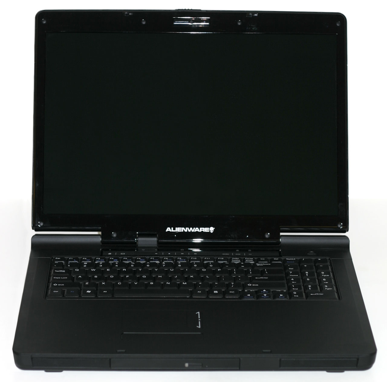
Opening up the laptop, the black motif is continued throughout the design. The black coating has a slightly tacky/rubberized texture that we found to be pretty cool and unique. It can still hold a fingerprint, but it wipes clean pretty easily. A typical 1.3 MP webcam sits above the display; the webcam isn't particularly noteworthy but it does meet that feature requirement. As with most integrated web cams, however, the microphone pickup could be a lot better.
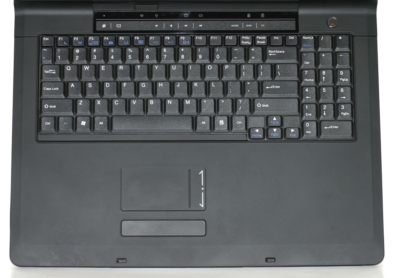
We commented in our PC Club ENP660 review that we personally liked having the number keypad on the right side, even if it did result in shifting the rest of the keyboard to the left slightly. With a larger chassis, Alienware is able to include the number keypad and still keep the rest of the keyboard more or less centered. The keys are also full-size, except for the function keys and cursor keys which are slightly smaller. In order to keep the number keypad as narrow as possible - and avoid pushing the keyboard to the left - the arrangement is slightly different than what you would find on a regular desktop keyboard. Specifically, the period key is shifted up to the top left and the plus and minus keys are placed next to it. The large enter key gets moved down to the bottom next to the zero. Unfortunately, for any 10-key typists this arrangement will definitely require some time spent adapting, and we never could get used to the positioning of the decimal point, plus, and minus keys.
The rest of the keyboard is all generally pleasing to use, and the control key is in the preferred bottom left location, with the Fn key next to it. A row of touch sensitive buttons just above the function keys provides quick access to Internet, email, and multimedia functions. Unfortunately, we're big fans of having dedicated home, end, page up, and page down keys, but in order to access those you will need to use the Fn key in combination with the cursor keys. If there were a way to include these four keys without changing anything else, i.e. by having an extra column in between the keyboard and the numpad, that would be better. Another option would be to use the blank spots just above the cursor keys and relegate the print screen and pause buttons to Fn access.
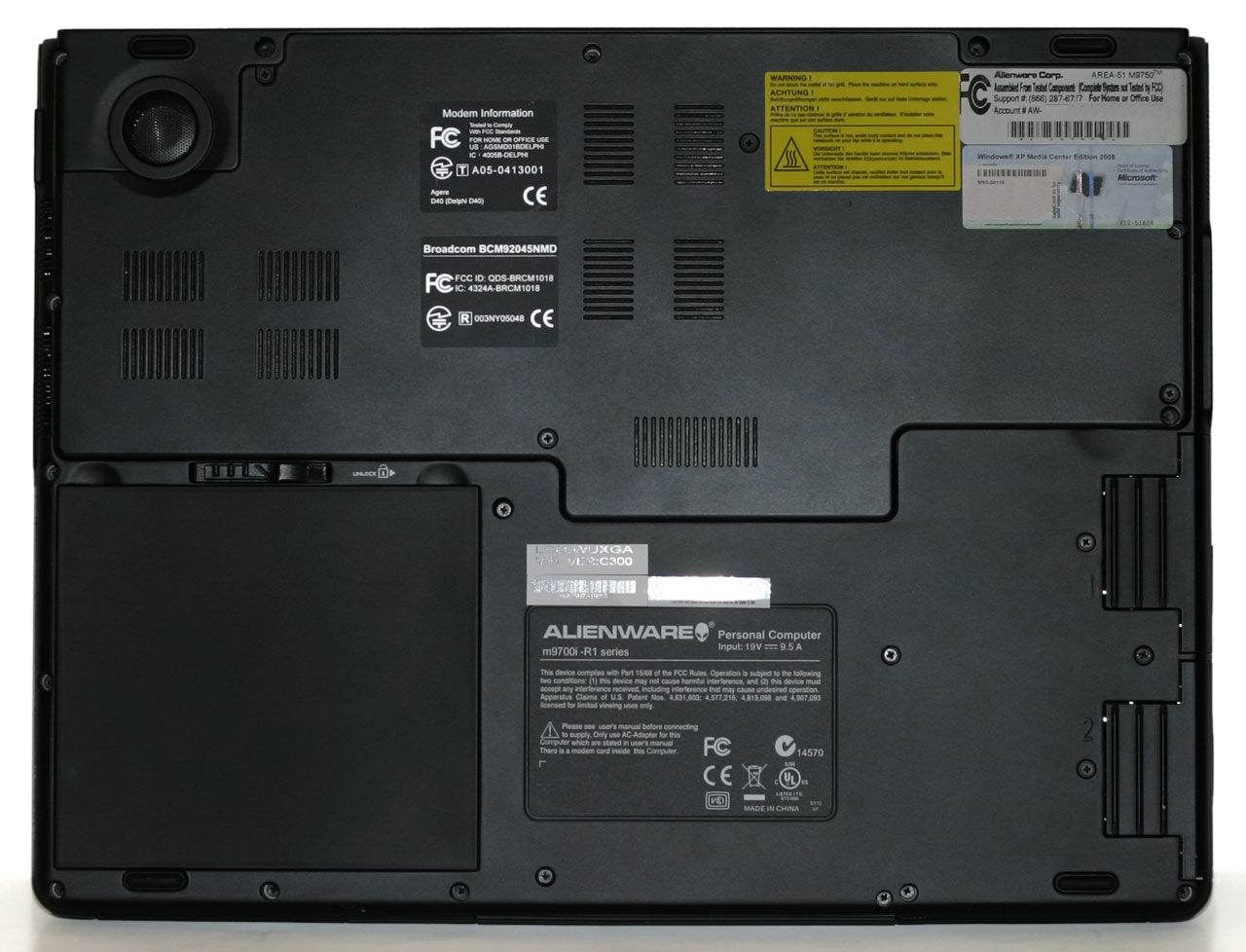
The bottom of the notebook has one large compartment secured by four screws that gives access to the memory slots and other internals. The hard drives are on separate sleds that can be inserted into the side of the notebook; each is secured by a screw on the bottom of the notebook.
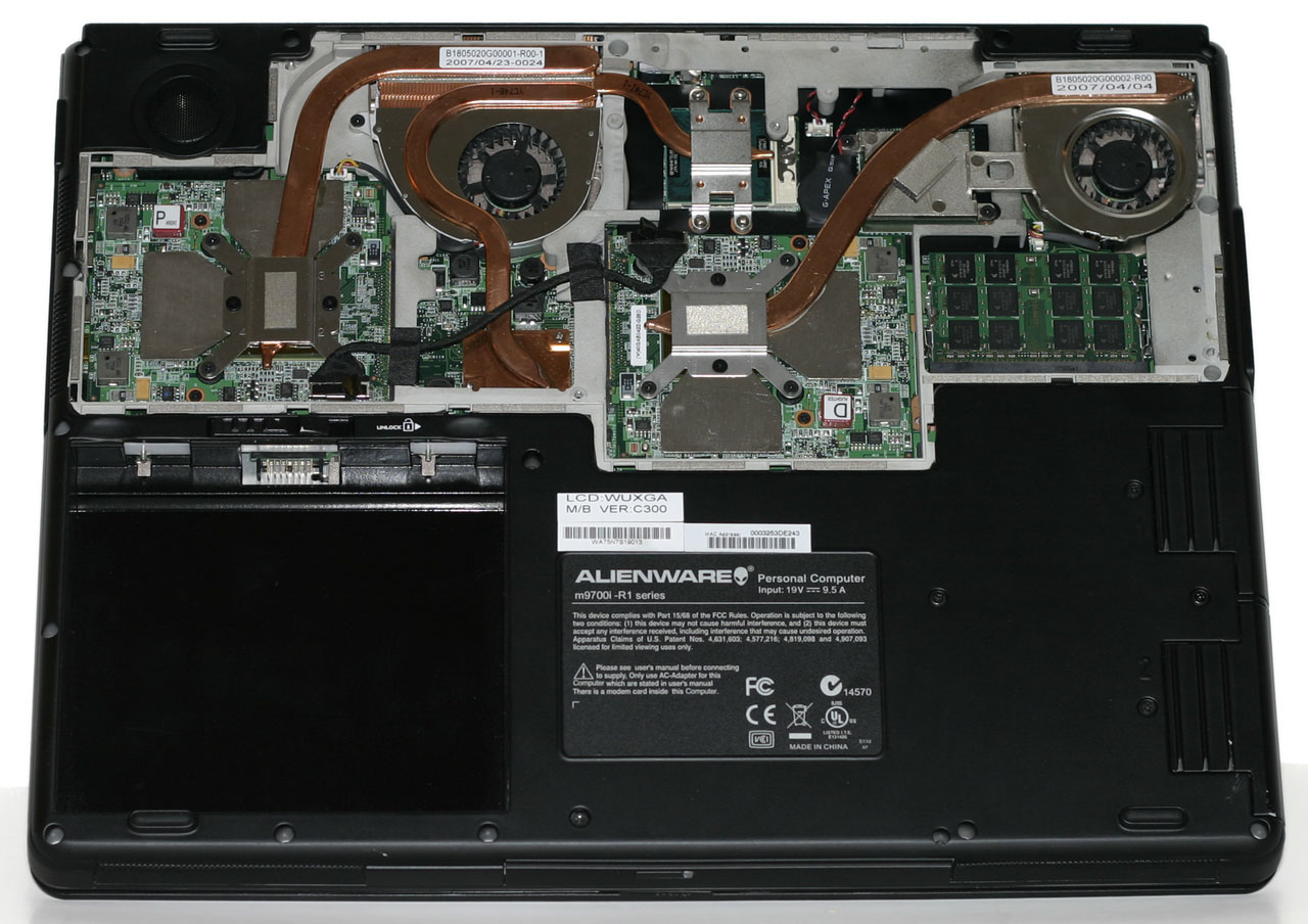
Removing the bottom cover, you can quickly see how much effort was spent in providing adequate cooling for all of the components. Heatpipes are used to help convey heat over to the radiators and fans, with the radiator on the left being slightly larger in order to deal with the extra components. The main silver blocks cover the two 7950 GTX graphics chips as well as the 512MB of memory for each chip. In the top center is the 945PM chipset, and below the left fan is the ICH7-M Southbridge. The right fan has a heatpipe leading from the second GPU and across the Core 2 Duo processor. It's almost a bit surprising that a single small fan and heatpipe are capable of cooling the GPU and CPU, but the right exhaust actually tended to be about 5°C cooler than the center exhaust.
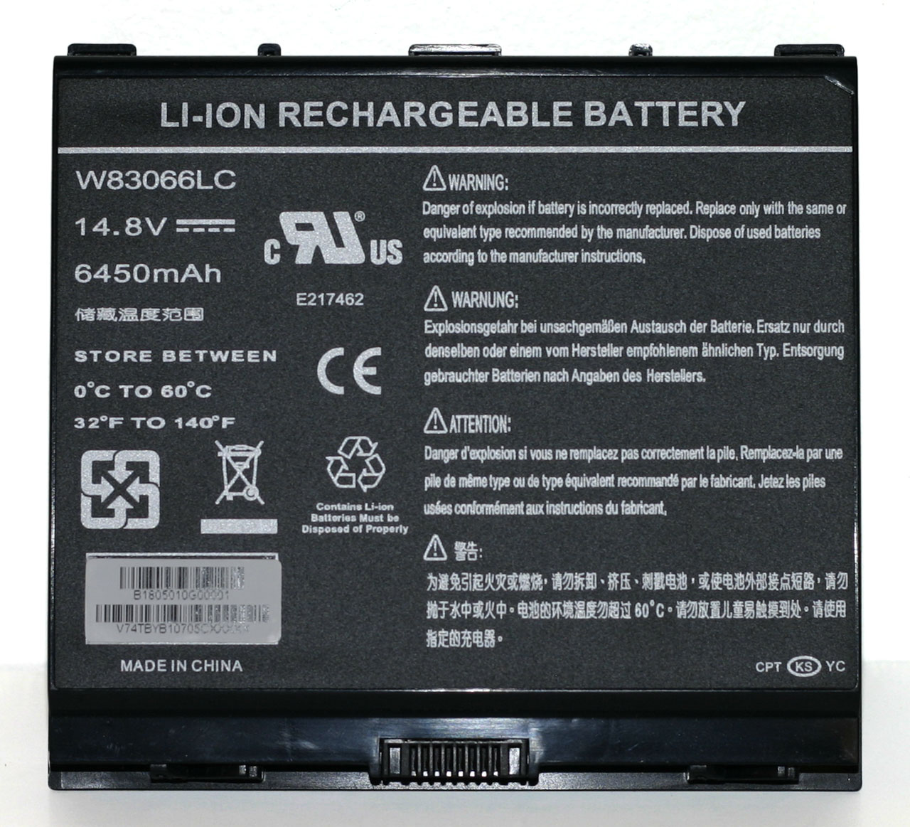
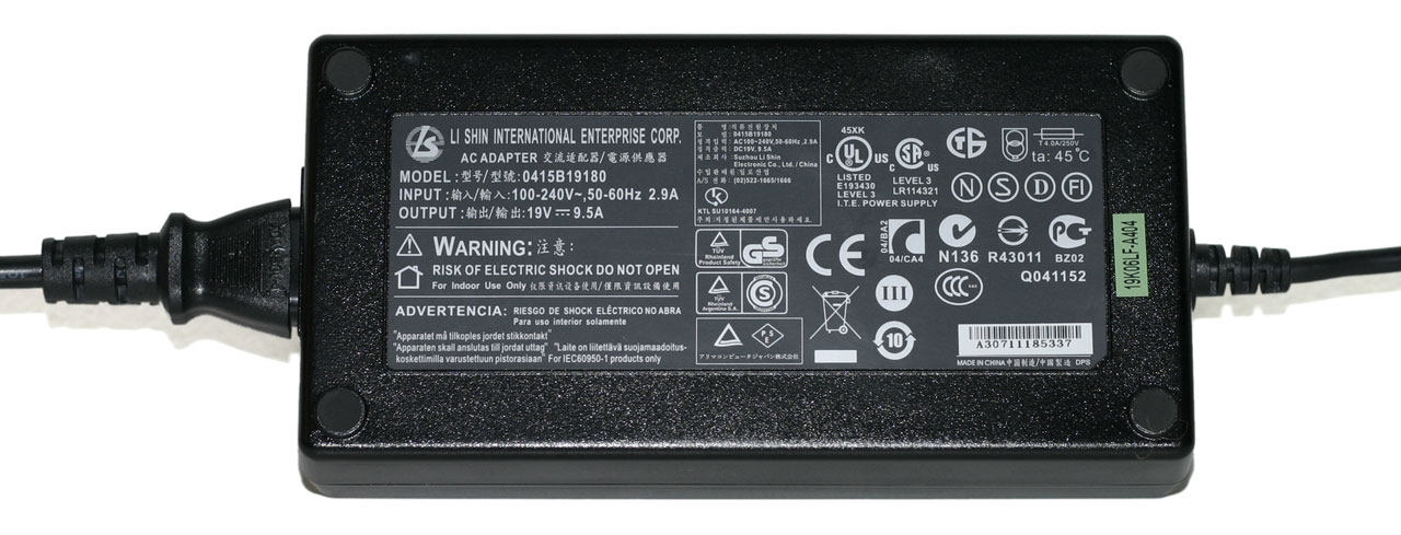
Given all of the power-hungry components that are present, it's no surprise that the laptop comes with a rather large 95 WHr battery. Even with a battery that's twice as large in terms of capacity as many other notebooks, don't expect a lot of battery life from the m9750. Also note the size of the power brick; it's capable of delivering a whopping 180W of power, twice as much as many 17" notebook power bricks. It's also very large and heavy - below it is a Gateway power brick that's more typical of what you would find with a midrange Santa Rosa notebook; not only is it much smaller, but it can only deliver 65W of power. Just in case you're wondering, we can say without doubt that the large power brick is necessary. When running games, power draw routinely spiked at over 180W (not counting for power adapter inefficiencies).
Taking a look at the big picture, the Area-51 m9750 is really an elegant design considering all of the engineering obstacles that had to be overcome. All of the major components are easily accessed, and the system manages to run stable even while dissipating over 150W of power. The notebook also comes with Alienware's unique appearance that is certain to turn heads and draw stares of envy. This is definitely a luxury notebook - we can't think of many people that would actuallyneed a gaming notebook - but if you can afford the price of entry you will definitely be pleased with the design and features it offers. Gaming performance however is a bit of a mixed bag that we'll explore more in a moment.
 |
Opening up the laptop, the black motif is continued throughout the design. The black coating has a slightly tacky/rubberized texture that we found to be pretty cool and unique. It can still hold a fingerprint, but it wipes clean pretty easily. A typical 1.3 MP webcam sits above the display; the webcam isn't particularly noteworthy but it does meet that feature requirement. As with most integrated web cams, however, the microphone pickup could be a lot better.
 |
We commented in our PC Club ENP660 review that we personally liked having the number keypad on the right side, even if it did result in shifting the rest of the keyboard to the left slightly. With a larger chassis, Alienware is able to include the number keypad and still keep the rest of the keyboard more or less centered. The keys are also full-size, except for the function keys and cursor keys which are slightly smaller. In order to keep the number keypad as narrow as possible - and avoid pushing the keyboard to the left - the arrangement is slightly different than what you would find on a regular desktop keyboard. Specifically, the period key is shifted up to the top left and the plus and minus keys are placed next to it. The large enter key gets moved down to the bottom next to the zero. Unfortunately, for any 10-key typists this arrangement will definitely require some time spent adapting, and we never could get used to the positioning of the decimal point, plus, and minus keys.
The rest of the keyboard is all generally pleasing to use, and the control key is in the preferred bottom left location, with the Fn key next to it. A row of touch sensitive buttons just above the function keys provides quick access to Internet, email, and multimedia functions. Unfortunately, we're big fans of having dedicated home, end, page up, and page down keys, but in order to access those you will need to use the Fn key in combination with the cursor keys. If there were a way to include these four keys without changing anything else, i.e. by having an extra column in between the keyboard and the numpad, that would be better. Another option would be to use the blank spots just above the cursor keys and relegate the print screen and pause buttons to Fn access.
 |
The bottom of the notebook has one large compartment secured by four screws that gives access to the memory slots and other internals. The hard drives are on separate sleds that can be inserted into the side of the notebook; each is secured by a screw on the bottom of the notebook.
 |
Removing the bottom cover, you can quickly see how much effort was spent in providing adequate cooling for all of the components. Heatpipes are used to help convey heat over to the radiators and fans, with the radiator on the left being slightly larger in order to deal with the extra components. The main silver blocks cover the two 7950 GTX graphics chips as well as the 512MB of memory for each chip. In the top center is the 945PM chipset, and below the left fan is the ICH7-M Southbridge. The right fan has a heatpipe leading from the second GPU and across the Core 2 Duo processor. It's almost a bit surprising that a single small fan and heatpipe are capable of cooling the GPU and CPU, but the right exhaust actually tended to be about 5°C cooler than the center exhaust.
 |
 |
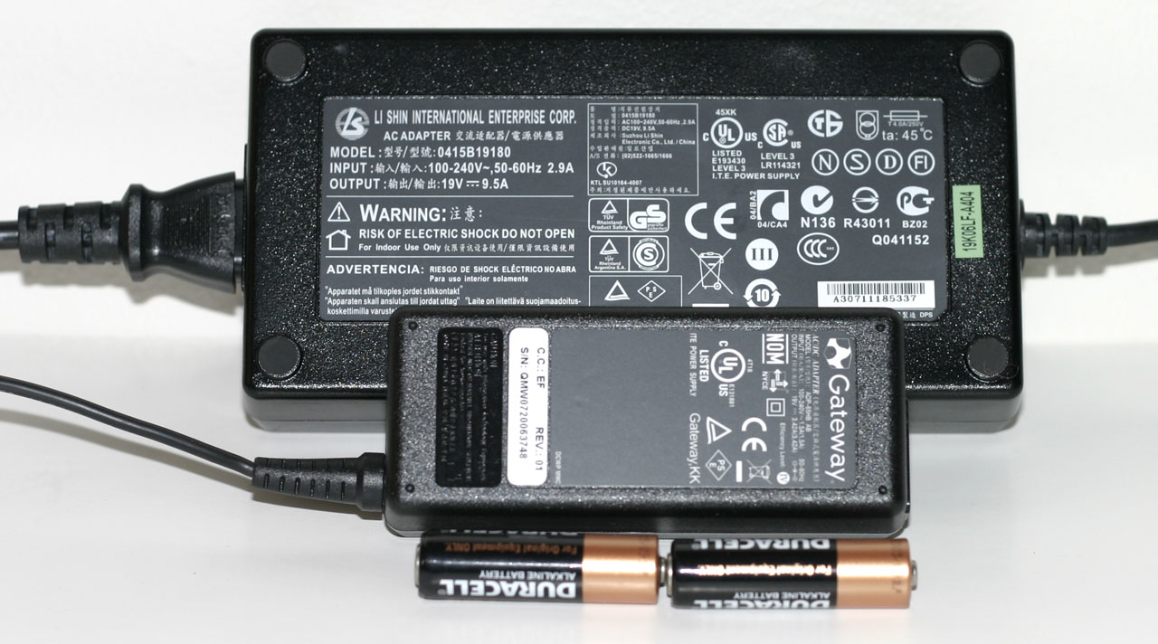 |
Given all of the power-hungry components that are present, it's no surprise that the laptop comes with a rather large 95 WHr battery. Even with a battery that's twice as large in terms of capacity as many other notebooks, don't expect a lot of battery life from the m9750. Also note the size of the power brick; it's capable of delivering a whopping 180W of power, twice as much as many 17" notebook power bricks. It's also very large and heavy - below it is a Gateway power brick that's more typical of what you would find with a midrange Santa Rosa notebook; not only is it much smaller, but it can only deliver 65W of power. Just in case you're wondering, we can say without doubt that the large power brick is necessary. When running games, power draw routinely spiked at over 180W (not counting for power adapter inefficiencies).
Taking a look at the big picture, the Area-51 m9750 is really an elegant design considering all of the engineering obstacles that had to be overcome. All of the major components are easily accessed, and the system manages to run stable even while dissipating over 150W of power. The notebook also comes with Alienware's unique appearance that is certain to turn heads and draw stares of envy. This is definitely a luxury notebook - we can't think of many people that would actuallyneed a gaming notebook - but if you can afford the price of entry you will definitely be pleased with the design and features it offers. Gaming performance however is a bit of a mixed bag that we'll explore more in a moment.


26 Comments
View All Comments
MissPriss - Monday, August 27, 2007 - link
Who are *you* to correct misspellings?!JarredWalton - Monday, August 27, 2007 - link
I'm Jarred Walton, and I think Yyrkoon knows I'm only kidding around. (I hope?) Who are you? :)PeteRoy - Friday, August 24, 2007 - link
I hate these graphs that you have to look at the legend and remember the colors to be able to compare the systems.Bring back the old bars that are easy to understand with the system name on the left of the bar without it going up and down in the chart.
Please.
Frumious1 - Friday, August 24, 2007 - link
I think the charts are fine! If anyone finds the graphs in this review to be too difficult to understand, I'm not sure what they're doing reading Anandtech in teh first place. The technical jargon is a lot more confusing than a graph that shows the Alienware laptop consistently at the top, but most of us manage to deal with that.customcoms - Friday, August 24, 2007 - link
99% of your graphs, including all of the ones in this article, are very easy to read and make the most sense for the data conveyed. And if anyone has tried making graphs on a computer before, you can understand the often annoying, time-consuming process it takes, and appreciate the work Jarred and the other anandtech editors go through so we can spend 10 seconds looking over a graph that probably took 10 minutes to make.The only graphs I have a problem with are the cooling graphs in the heatsink reviews, and the problem with those is there is too much data for the graph!
sc3252 - Saturday, August 25, 2007 - link
Graphs are some of the easiest things to make in articles, writing should be the long part. At most they take 3 minutes or less in any decent office program. As far as their readability, I didn't have any problems, but I did just skim the article.JarredWalton - Sunday, August 26, 2007 - link
Mwahahahahaaa! 3 minutes for the graphs!? Wow, you need to try doing one of these things. That, or I seriously need to get a clue on how to do Excel graphs faster. Let me give you a rundown of how it goes.1) Take spreadsheet from last article and insert a new row (or two) for every benchmark with the name of the new tested system. Then input the new results. This usually takes 15 minutes and is the easiest part.
2) All the stuff done with the AnandTech graphing engine is relatively straightforward: export the Excel to CSV, then import that into the graphing engine. Go through and size all the graphs as necessary and change line coloring. 15-30 minutes depending on the article, usually.
3) The graphs in Excel. Wow, where to begin? First, since I'm now using Excel 2007, there are some MAJOR graph bugs. If you just right-click a chart and try to change the source data, the charts go nuts. I have no idea what MS did, other than adding some nice line antialiasing, but the Excel 2007 chart UI is garbage as far as I'm concerned. So, I start (on a second PC) in Excel 2003. *IF* all of the benches are the exact same as a previous article, it's pretty simple: you change the source data for each chart to include the new laptop. Modify the line for that laptop so that it's thicker, and make sure all the line colors and thickness settings are correct (i.e. so that the same laptop is always the same color). This usually takes at least 30 minutes.
In this article, there were several sources for the benchmarks. The gaming stuff was mostly from the Dell M1710 article, while some of the other benchmarks came from elsewhere (i.e. the PC Club article). (Sometimes, adding another system can make the legend too big, so then you're stuck with resizing and such.)
4) Once the charts are done in Excel 2003, I save and open in 2007 (to get the nicer looking lines). Then I take screen captures, paste into Photoshop, and crop off the excess white space and other junk. (This involves a lot of select/copy/past stuff, plus a couple macros to help with the cropping.) I spent at least a couple hours getting all of the gaming charts updated and making sure they look right. I wish Excel communicated better with Photoshop, but I find that when I just copy the chart and paste into PS, things usually get resized a bit in random ways. Since I want all the charts to be the same size, that just doesn't work for me.
As an aside, the LCD results alone typically take a couple hours to get ready, adding the data, resizing, tweaking, etc. (Not to mention running the benchmarks for all of this stuff multiple times, but I'm sure everyone realizes how much time that can take).
Bottom line, I find that getting *all* the graphs ready (plus often rerunning a few tests at the last minute because the results don't look right initially) is an all-day affair. Then there's the images... that's easily another day or two, taking, retaking, and then Photoshopping the pictures. (Let's just say that the laptop pictures aren't taken against a pure white background with no texture, so there's a lot of cleanup involved.) This article was intended to be done by Wednesday, but over the course of the week it ended up getting finished Friday morning.
Running the tests is still the longest part of any review, however, especially if there's any back-and-forth between the manufacturer, or some issues come up that need to be addressed. (For example, I tried to review an Alienware notebook last year and eventually had to give up because of some testing issues I kept encountering on that model.) If someone could give me all the data I needed - and I trusted the source - and all I had to do was write the text, I think I could get the text done in two days at most. Basically, I count on three weeks of testing and benchmarking (I don't even want to think how often I install Windows in any given week....) followed by a solid week's worth of writing. If I cut out certain tests, I could probably reduce the testing significantly, but then I wouldn't be as sure of the results.
If any of you really think this stuff seems easy and would like to give it a shot - realizing that proper benchmarking and the ability to get repeatable results is very high on the list of priorities - drop me a line. Gary has talked with a lot of people about doing motherboard reviews, but by the time they realize everything involved, many decide it's not worth the effort. No guarantees or anything, but if you know hardware and can write coherently, there's a good chance we can use you. Convincing us that you're worth hiring: that's the hard part. :)
JarredWalton - Friday, August 24, 2007 - link
I tried to make sure all the colors were consistent in the scaling graphs. I just can't imagine that stretching the gaming results into nine pages with 36 graphs would really help that much, especially in this type of article. The scaling graphs are so clear that I'm not sure what the difficulty is. Alienware is the bar at the top, XPS M1710 is next, ABS Z5 is below that, and the ASUS A8Js and G2P occupy the bottom area. These charts actually require quite a bit more effort to create than a simple bar chart, but the data density is higher, conveying information in a much more concise fashion. For example, it allows everyone to quickly see whether we're CPU limited or not.I'm curious, how many other readers out there really dislike these types of charts? If no one thinks they're useful, I could save myself quite a bit of effort. Or is this just a case of a vocal minority, and most of you agree with me that the scaling charts are better? Let me know.
strikeback03 - Tuesday, August 28, 2007 - link
I like these charts better. Lots of bar charts would take forever to compare across charts and pages.Not shown in this review, but occasionally your results have a bar chart for one resolution and then the line graphs for all resolutions. The Bar chart seems redundant when the numbers are listed in the line chart and you have the line.
kmmatney - Friday, August 24, 2007 - link
The charts look fine here. However similar charts used in the CPU heatsink articles have gotten out of hand...